
DIVI 5 • FLEXBOX DEMO
Build fluid layouts without writing a single line of CSS
This page demonstrates every major flexbox setting available in Divi 5 — from direction and alignment to wrapping and gap control.
layout direction: row · gap: 10px
flex: 1
flex: 2
flex: 3
LAYOUT direction: column · align-items: stretch
align-items: stretch
flex: 1
Flexbox Property
Layout Direction
Controls the direction of a column or row.
row
Items align from left to right (start to end).
1
2
3
row-reverse
Items align from left to right (end to start).
1
2
3
column
Items align from top to bottom.
1
2
3
column
Items align from bottom to top.
1
2
3
Flexbox Property
Justify Content
Controls how flex items are distributed along the main axis of a row or column.
flex-start
items packed to the start
1
2
3
flex-center
items centered on the axis
1
2
3
flex-end
items packed to the end
1
2
3
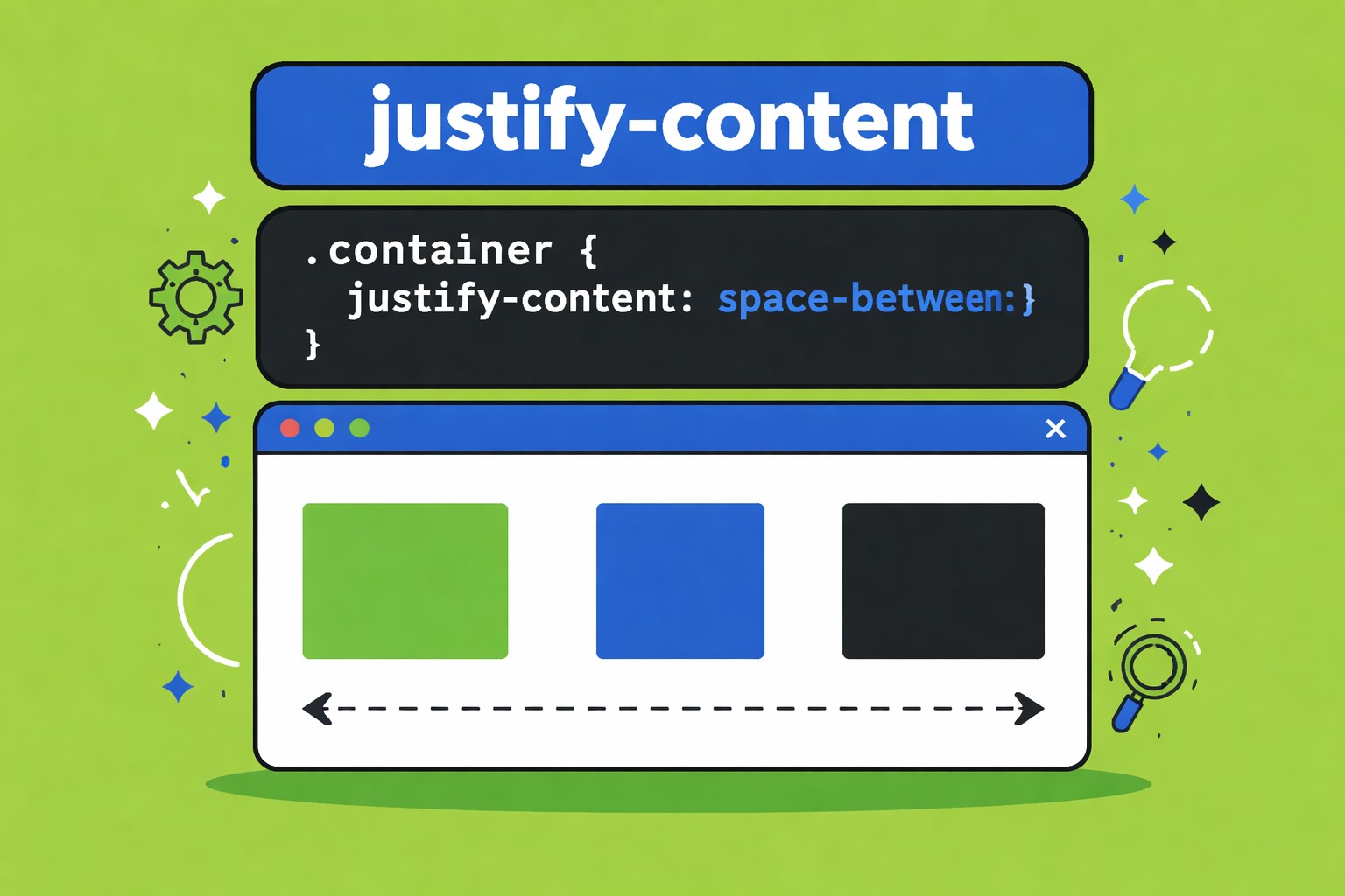
space-between
first & last touch edges, even gaps between
1
2
3
space-around
equal space around each item
1
2
3
space-evenly
equal space between all items and edges
1
2
3
Flexbox Property
Align Items
Controls cross-axis alignment — how items sit vertically when the row direction is horizontal.
1
2
3
flex-start
1
2
3
center
1
2
3
flex-end
1
2
3
stretch
Flexbox Property
Layout Wrapping
flex-wrap: wrap lets items flow onto new lines.
layout wrapping: wrap
horizontal gap: 10px
vertical gap: 10px
items reflow at natural widths
1
2
3
4
5
6
7
8
9
10
11
12
layout wrapping: wrap
column class: 1/3
horizontal & vertical gap: 10px
six column row set to wrap.
Flexbox Property
Align Content
Controls how wrapped lines are distributed along the cross axis — but only works when items actually wrap onto more than one line.
layout wrapping: wrap
height: 180px
horizontal & vertical gap: 10px
required for align-content to have any effect
stretch:
lines occupy full height
1
2
3
4
5
6
7
8
9
10
11
12
flex-start:
lines packed to the top
1
2
3
4
5
6
7
8
9
10
11
12
center:
lines centered vertically
1
2
3
4
5
6
7
8
9
10
11
12
flex-end:
lines packed to the bottom
1
2
3
4
5
6
7
8
9
10
11
12
space-between:
first & last lines touch edges
1
2
3
4
5
6
7
8
9
10
11
12
space-around:
equal space around each line
1
2
3
4
5
6
7
8
9
10
11
12
space-evenly:
perfectly even gaps throughout
1
2
3
4
5
6
7
8
9
10
11
12
LAYOUT EXAMPLE • Layout Direction
Blog
layout direction: row
layout direction: row
horizontal gap: 4%
vertical gap: 5%
JD
Jordan Davis
May 28, 2026 • 8 min read
Why flexbox changed everything in Divi 5
Before Divi 5, achieving complex layouts required workarounds and custom CSS. Now, the native flexbox engine gives you fine-grained control directly inside the visual builder — with full responsive breakpoint support baked in from the start.
Tip: Set Layout Wrapping > Wrap on any row module to create automatically responsive grids without breakpoint overrides.
With Divi's flexbox integration, you can easily manage layout direction to control how design elements are arranged in rows or columns, enhancing the visual flow and user experience. This feature allows for smooth adjustments in alignment and spacing to suit various screen sizes, empowering designers to craft dynamic and responsive layouts that look stunning on any device, ensuring your content stands out in every scenario.
TOPICS
QUICK STATS
CSS Properties Covered
12
Demo Sections
6
Reading time
8 min
LAYOUT EXAMPLE • JUSTIFY CONTENT
Hero
justify content: space-between
layout direction: row
layout wrapping: wrap (mobile only)
vertical gap: 0px
align items: center
Push Content to the Edges — Effortlessly
With justify-content: space-between, Divi 5 automatically distributes your modules across the full width of a row — no manual spacing, no custom CSS. Items sit flush at each edge with perfectly even gaps in between.
%
UPTIME
USERS
COUNTRIES
SUPPORT
RATINGS
YEARS
LAYOUT EXAMPLE • ALIGN ITEMS
Pricing Tables
align items: end
horizontal gap: 20px
STARTER
$9
/mo
Perfect for personal projects and small sites.
- 1 Website
- 10GB Storage
- Email Support
PRO
$29
/mo
Everything in Starter, plus advanced features for growing businesses that need more flexibility and power.
- 5 Websites
- 100GB Storage
- Priority Support
- Advanced Analytics
AGENCY
$59
/mo
Built for teams and client work at scale.
- 25 Websites
- 500GB Storage
- Dedicated Support
- White Label
- Team Accounts
ELITE
$99
/mo
For enterprises and high-volume agencies that need maximum power, performance, and dedicated account management.
- Unlimited Websites
- 2TB Storage
- Account Manager
- SLA Guarantee
- Custom Integrations
- Audit Logs
LAYOUT EXAMPLE • Layout WRAPPING
Blurbs
layout wrapping: wrap
horizontal & vertical gap: 20px
align content: stretch
Visual controls
Adjust every flex property directly in the Divi 5 builder panel — no code required.
Responsive by default
Set different flex values per breakpoint — desktop, tablet, and phone simultaneously.
Nested flex rows
Any module can become a flex container, allowing deeply nested layout structures.
Gap control
Row gap and column gap are set independently — precise control over every gutter.
Order property
Reorder flex children visually without changing HTML source order.
Align self override
Each child can override the parent's align-items value with its own align-self setting.
LAYOUT EXAMPLE • Layout WRAPPING + ALIGN CONTENT
Tag Cloud
layout wrapping: wrap
align content: space-between
justify content: center
height: 175px
Flexbox
Divi 5
Justify Content
Align Items
Wrap
Visual Builder
Responsive
No-Code
CSS Grid
Flex-End
Space Between
Align Content
Layout Direction
WordPress
Nested Rows